greerwatson


Prompt 1: Amber
Prompt 2: Topaz

For a number of years now, I've been tweaking background tiles to create new ones. Most of them came from the now-defunct GRSites.com; and I used their software for some of the modifications, along with Microsoft Picture Manager. In particular, I have been working on one called (on that site) brown128.jpg. I think it's fair to say that it's the most productive background tile I've ever played around with—though it's also possible that that has something to do with the fact that I've been manipulating it for over a decade, and am now on the umpteenth generation.

This is the original graphic. If you click on it, you can see what it looks like when tiled to cover the whole page:


I've made many variations, some of which have already been used on my website. At first, it was more a question of intensifying and slightly colour-shifting the original using the doohickey on GRSites. Here are three that all are a similar blend of shades that produce an amber effect—tan, rust, brown, gold and so on. (I've displayed them at a smaller size so that I can fit them all side by side.) Again, you can see how it looks if you click on the graphic. Even apparently slight changes can make a difference when the background is tiled over the whole webpage.


Then, I started using the filters/etc. in Microsoft Picture Manager to refine the variants. For instance, you can affect the boldness of the pattern in a variety of ways.


Then, for a while, I went in the opposite direction: I tried to get "solid" patterns, where the overall impression was of a single colour rather than a combination, but where the original feathery pattern was still clear. This is a lot harder than you might think! Look at the ones below: versions like the first one came fairly readily, but have a definite light-and-dark quality. The subtler pattern on the last one all too easily lost clarity.


More recently, though, I've managed to get the graphic to shift in more malleable ways. Some of the results have been downright startling. Even so, the original feathery pattern is always clearly discernible. Here is a selection. Since I'm doing this for both Amber and Topaz, I've added some with yellow tones as well:


greerwatson


Prompt 7: Zephyrus

The child of Dawn (Eos) and the Titan Astraeus, Zephyrus represents the West wind. Zephyrus was considered to be the gentlest of the Anemoi (wind gods representing the cardinal points of the compass), and the beneficial bringer of Spring. The gentle springtime winds of the West indicated an end to Winter and the new growth of plants and flowers.
Spring in summer?

I'm going to rec two stories I wrote a while back; or, if you don't want to bother with the actual fic, then just have a peek at the webpage design. *g*

"Fairies of the Orchard" is a little Flower Fairies treat that I wrote for Yuletide one year. The fairy in question is the Apple-blossom Fairy—or is it? There's a touch of John Barleycorn to this tale, as blossoms turn to fruit and the fairy undergoes a metamorphosis. (On AO3.)

Applefic started as a series of ficlets based on Mary Renault's The Charioteer. The name has its own history: basically, that I couldn't come up with a title, kept referring to it as "my applefic", and got so in the habit that I finally just made that the title. It has a sort of dual time to it: each chapter is set consecutively round the calendar and each describes an incident in the hero's life from early childhood (when he first moves to the village), through older childhood and his teen years, until he finally moves out of the cottage for good after World War II, i.e. after the timeframe of the book. On my website, each chapter has its own apple-themed design, season by season; and, since it begins and ends in spring, the first and last both have the same apple-blossom background. (On AO3.)

Both stories have this in common: spring leads to summer, thence to fall and winter, and so round the calendar. And then comes the following year.


greerwatson
28 July 2021 @ 12:21 am


Prompt 5: Pan

Part man and part goat, Pan is a nature god well known in many mythologies. Born in Arcadia to Hermes and a dryad, Pan was a precocious child whose goat’s feet and horned head delighted the gods, but startled the mortals he lived nearer to; Pan did not live on Mount Olympus, but rather in the forests and wilds of Arcadia. Pan famously invented a musical instrument: the syrinx, or pan pipes as they are more commonly known. He is known for his haunting melodies, and music was often a central part to his worship.
I racked my brain over this one before it occurred to me to consider the bonus prompt, "Chimaera". Well, in Greek mythology, that was the name of a hybrid monster that was part lion, part goat, and part snake (and hence quite an appropriate extra prompt for Pan, who is half man and half goat). Nowadays, the term has been extended to mean living beings with two distinct sets of DNA.

Which made me think of fanfic crossovers.

On the whole, they're not the sort of thing that appeals to me. It's not the concept in itself: it's just that, when I'm looking through the collection for a gift exchange, it's very rare that I know enough about both (or all!) the fandoms involved to be able to appreciate the story. And only once have my offers included a crossover. It was a few years ago when I realized at the last minute that none of the things I was offering for [community profile] everywoman had been requested by any of the other participants. I combed through everything in vain until, finally, I decided to try to see if any the crossovers might suit. Even then, if a hint of a plot hadn't—astonishingly!—occurred to me, I'd simply have deleted my sign-up.

I guess I just don't naturally come up with ideas that properly mix two or more different fandoms in the same fic. And, when I say "properly", I mean giving each a fair shake. One of the commonest problems with a lot of the stories that are tagged as crossovers is a failure to balance the fandoms more or less evenly. All too often, what you get is a mere cameo appearance so slight that it hardly even merits the name "crossover", and you wonder why the author bothered.

That's not the case with RecessiveJean's "The Girl in the Glass", though. It's a Narnia/Harry Potter crossover focusing on Polly Plummer and Ginny Weasley. A magic mirror allows them to communicate across time; and, although the story focuses a bit more on Polly's side of things, Ginny opens and closes the account. In the end, all is balanced out most excellently.


greerwatson
Prompt 6: Amphitrite

Amphitrite is the goddess of the sea, wife of Poseidon, and eldest of the fifty Nereides. She is the female personification of the ocean: the mother of fish, seals and dolphins. Poseidon chose Amphitrite from among her sisters as the Nereids performed a dance on the isle of Naxos. Refusing his offer of marriage, she fled to Atlas. The dolphin-god Delphin eventually tracked her down and persuaded her to return to wed the sea-king. She also bred sea monsters, and her great waves crashed against the rocks, putting sailors at risk.
This picture has turned up twice as the wallpaper when I start my computer. It's called "Beautiful ocean surfing wave at sunset beach, Havelock Island, India"; and I finally found it on the web! It's partly the luscious curve of the wave, but also the extraordinary colours.


greerwatson
Prompt 4: the Furies
The Furies, also known as the Erinyes, are a trio of vengeance deities whose immortal task is to hear complaints of insolence from mortals—and to punish those crimes by hounding the culprits relentlessly. They are said to focus on punishment for lying, killing, or sinning against the gods, but any lawbreaking was indeed punishable by them.

“Alecto was the oldest, unceasing in anger. Megaera was next, retaliator of jealousy, and Tisiphone, the last, regarded as the avenger of murder.”
― Elisabeth Naughton, Stolen Fury

Maybe you are inspired by Alecto (“the implacable one”, incites war), or perhaps Megaera (“the envious one”, vengeance) speaks to you, or maybe even Tisiphone (“avenger of murder”, guards the gates to Tartarus) – however you want to interpret the prompt, we’d love to hear from you!

Janette with fangs
On consideration, I decided to do another self-rec for this prompt. (I notice that several other participants are self-reccing this year.)

One would think that, among my various Forever Knight based stories, there'd be plenty that fit this motif. We are, after all, talking not only about vampires but a dysfunctional family where Divia slew her own master Q'ara, LaCroix slew Divia, and Nick did his level best to slay LaCroix. Shades of Greek mythology! However, where these characters are concerned, I tend to try to look beneath the obvious to unpick deeper psychological causes than mere revenge.

So instead I'm going to turn to war.

For those who don't know Forever Knight, there's a bit of backstory to "The Siege of Hastings". The protagonist of the show, Nick Knight, was turned into a vampire in 1228. This every writer ought to know, since the voiceover to the opening credits tells you so each week. Nevertheless, what is obvious to a fan writer is not necessarily so to a scriptwriter, especially in a show that apparently had no proper book—and definitely had a loosey goosey attitude to continuity. At any rate, in the episode "Forward Into the Past", Nick calls in a favour from another vampire whom he saved "at the Battle of Hastings". Which took place in 1066.

Fans have, of course, written fix-its ever since: they range from time-travel to bar fights in a Hastings pub. I was asked for a story with a new approach. If you're curious, you can read the comments on AO3 here.

It is obviously pure coincidence that the story stars three vampires and there are three Furies. Which is who is up to you.


greerwatson
Prompt 3: Hecate
Otherworldly and mysterious, Hecate is best known for her association with magic, ghosts, and the night. If you hear the baying of hounds in the dark, she's likely near as they were ever at her side. She is traditionally depicted as bearing two torches to light her way or as a triple goddess of the crossroads. In mythology she is known for helping Demeter search for her daughter Persephone, a theme that ties her even more to the Underworld and spirits she is associated with. Today she is often considered a representative of those liminal places where reality bends and all manner of events may unfold...

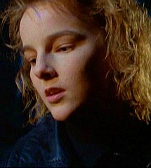
Divia
For this prompt, I'm self-reccing a Forever Knight fic I wrote for Yuletide in 2016, "The Father, the Son, and the Unholy Ghost", which was a treat for [personal profile] astolat.

True, the "ghost" of the title is not a real ghost: it's Divia, the evil-seed vampire daughter of Nick's master, LaCroix, who turns her own father into a vampire in the flashback to the episode "A More Permanent Hell" and then returns from the grave in "Ashes to Ashes" to avenge his killing her when she proposed incest. "Ashes to Ashes" ends with Nick saving LaCroix from Divia by beheading her. All that does seems consistent with the Hecate prompt.

I have to admit that Divia was never a favourite of mine. She seemed pretty one-paced in her villainy (though it was intriguing to finally have an origin story for LaCroix). However, when I thought about it, I realized there had to be more to the history between her and her father than could ever have been fitted into a few flashback scenes. After all, a couple of decades separate the two episodes in which Divia appears; and, even in the long life of a vampire, much can happen in twenty years.


greerwatson
05 July 2021 @ 01:21 pm
Prompt 2: Eos
The dawn goddess Eos was almost always described with rosy fingers or rosy forearms as she opened the gates of heaven for the Sun to rise. Eos had a team of divine horses to pull her chariot, providing daylight as they climbed the arc of heaven scattering sparks of fire across the sky (she was also sometimes depicted aloft by the power of her own wings). Eos is known for having had many lovers, which has led to Eos being known by some as a goddess of joy and pleasure in addition to being the goddess of the dawn.
I thought, for Eos, I'd offer the webpage design for a story I wrote back in 2014, "A Little Chat over Breakfast".

Once upon a time, there was a LiveJournal community ([livejournal.com profile] maryrenaultfics) for fans of Mary Renault's books. It lasted for ten years, all told, though the decline in the last few years was becoming obvious (to everyone else, though possibly not to the moderators). Still, there had been a glorious fifth-anniversary celebration to which many of the members were active contributors. The main event was a series of stories set in a metaverse where the characters from all of Renault's books could meet at a clubhouse. The mods decided to do the same for the tenth anniversary as well.

Well, it wasn't the same. (Couldn't be, really.)

If you're up early, there's a stage when dawn looks a lot like dusk. Except for being in the east, of course.


greerwatson
05 July 2021 @ 12:32 pm
Prompt 1: Hades
Hades is the god of the dead and the king of the Underworld with which his name became synonymous. Despite modern connotations of death as evil, Hades was actually more altruistically inclined in mythology; his role was often maintaining relative balance between the realms. He was often depicted as cold and stern in his judgement, and he held all of his subjects equally accountable to his laws. Above all else, Hades ensured the finality of death and that none of his subjects ever left the Underworld.
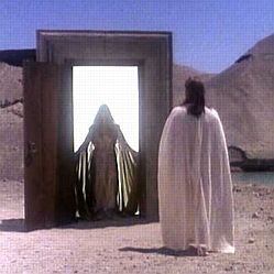
This prompt promptly prompted <g> me to think of Forever Knight, particularly the episode "Near Death", whose flashback shows us Nick's experience in 1228 after the vampire LaCroix drains him to the point of death.
Nick confronts his Guide figure at the gateway between life and death
He is offered the option of passing through a gateway to a brilliant light, representing death or some afterlife; but instead he chooses to answer LaCroix's call and wake to an altered immortal body.

It is an essential part of the vampire mythos, at least in this series, that they are not dead: being "undead" is something Other. For LaCroix (and most vampires in their community), actual death is The End; and, as such it is to be avoided at all costs. For Nick, whose quest is to reverse his vampiric condition, it is mortal life that he wants desperately to regain.

That death is the inevitable consequence of mortality is something that Nick accepts. Or, at least, in the strength of his current state and the health of his youth when he was brought over, he accepts death in theory. Whether, in the extremity of illness or age, he might alter his view ... well, that is a topic for fan fiction. Admittedly, few authors have tackled it.


greerwatson
Well, the [community profile] sunshine_challenge may be over, but—looking over what I've written on the colours—I find I still have a bit more to say.

In the last post, on VIOLET, I took colours beyond the spectrum and round the colour wheel, finishing up where it all started, i.e. with RED. However, I had the devil of a job doing that last bit:


VIOLET
RED


Although the end points were fixed (and I knew that #FF00FF needed to be in the middle), I kept fiddling with the hex codes, tweaking them over and over in an attempt to get a smooth set of transitions. Even now, I'm not satisfied.

Thinking about it after the fact, though, I think I've put my finger on the problem. Something [personal profile] silveradept wrote:
It's interesting - when I imagine the platonic examples of colors (which usually involves a crayon box), almost all of the shades of the Newtonian spectrum are dark, with the exception of yellow,[...].
I grew up with a set of basic colours that were essentially derived from the subtractive primaries. Oh, there was RED (instead of magenta + yellow) and BLUE (instead of magenta + cyan); but, as one mixed more paints together, things got darker. People who think in terms of additive primaries—originally scientists in Optics, but nowadays particularly people dealing with computers—are accustomed to having colours get lighter as they're added together.

What this means in practice is that, instead of the sequence above, I ought to find it easier to get a gradation by using dark shades.

Read more... )


greerwatson


With violet we come to the last hue in the visible spectrum, which is to say:


(Which was named for the colour of the flowers of Viola odorata.)

To me, violet is a shade of PURPLE. That is to say, "purple" is one of the basic colour words in English; and the word refers to a broad range of colours in the same way that BLUE, RED, YELLOW, and GREEN do—though PURPLE is not quite as basic a colour as those, being more on a par with ORANGE and TURQUOISE.

I would not, however, say that violet is focal PURPLE, i.e. the most perfect, ideal shade of PURPLE. That, to me, is a shade slightly more to the BLUE end of the spectrum:


Or, to put it another way, the perfect shade of PURPLE lies between indigo and violet: indigo is the colour transitional between PURPLE and BLUE; and violet lies at the far end of the spectrum. (Beyond that lies ultraviolet, which can't be seen by the human eye.)


BLUE
INDIGO
PURPLE
VIOLET


Read more... )


greerwatson


Given that I've already done TURQUOISE (Newton's "blue") and BLUE (Newton's "indigo"), what's left for INDIGO?

Well, the plant produces a blue-purple dye; and the colour is usually described as lying between blue and purple. So what's that?


Some might call this simply BLUE, especially if it presented in contrast with YELLOW, RED, and GREEN:


If, however, we compare it with BLUE and PURPLE (what I think of a a perfect PURPLE), then we can see it lies in between:


What we're looking at here is, I think, a sort of transitional colour: one that lies on the border between two basic colours. In the same way, GOLD is transitional between ORANGE and YELLOW; and CHARTREUSE is transitional between GREEN (especially lime green) and YELLOW.
Read more... )


greerwatson
17 July 2020 @ 03:33 am


So now we come to BLUE proper. To me, this is inherently a dark colour—though, of course, there are plenty of shades of blue from midnight to ice. It's the colour most associated with sapphires and delphiniums (though both come in quite different hues as well); and it's the colour of those little blue squill, Scilla sibirica, that are so commonly massed under shrubs in flower beds in the spring.

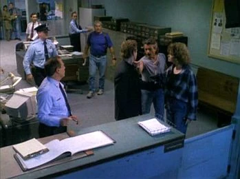
One association of blue is with the police; and one of my favourite fandoms, Forever Knight, is a cop show as well as a vampire show. Although Nick Knight himself is a plainclothes detective, there are uniformed officers in the police station in every episode; and they, of course, wear blue:


[NOTE: if you can't see the picture, click on it: I put a link on.]


In 2011, I wrote a story about Nick's first day in Homicide. "The New Guy" was written for [personal profile] lastscorpion in the small fandom-specific gift exchange, [community profile] fkficfest. The story was originally posted to LiveJournal (where the exchange was then run) and later crossposted to AO3 and my website.

The plot of "The New Guy" is based on the flashback to a Season 1 episode, "Only the Lonely", which tells how he first met Natalie Lambert. It is canon, therefore, that he was brought into the morgue in a bodybag, having been blown up by a pipe bomb while trying to stop a robbery. Then, being a vampire, he regenerated on the autopsy table. To her great astonishment, of course; but she was intrigued enough to offer to research his condition in the hope of finding a way for him to turn mortal again.

At that time, Nick was not yet a police officer. (Or, at least, not in Toronto. Another flashback told us about his time as a uniformed cop in Chicago in the 1960s.) It was sometime thereafter that he contrived to join the Metro Toronto Police and get immediately assigned to work Homicide at the 27th Precinct.

Since "The New Guy" was about Nick as a policeman, I decided to go with a plain blue background, and bordered the central story panel with a textured blue and black border picked out in gold. I used a police badge in various sizes as a divider between the sections: this was clipped from a screencap. Admittedly, it was a close-up of Det. Schanke's ID. (He was Nick's partner in Seasons 1 & 2.) But Nick's would have looked the same.


When I later wrote two more canon-based stories told from alternative perspectives, "Shift" and "Copper's Instinct", I reused the same webpage design.


greerwatson


To me, turquoise is a cool, fresh hue that reminds me of water and the tiles you find in bathrooms and swimming pools. However, if you say "tiles" to any Forever Knight fan, they will immediately think of Natalie's office in the Coroners Building in Toronto.

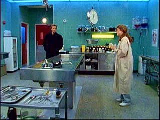
The exterior views were filmed on location; but the interior was a permanent set. By positioning the camera behind whatever wall was broken away, it always looked a lot larger than it actually was, which—from the few steps needed for the actors to cross it—must have been pretty small. The most prominent feature was an autopsy table in the middle of the room, since Dr. Lambert (played by Catherine Disher) was a pathologist. But one corner had her computer and filing cabinets; and the opposite end had a lab desk; so it was by way of being a sort of all-purpose room that you'd never get in the real world. Let's just say that the series was done on a low budget!


[NOTE: if you can't see the picture, click on it: I put a link on.]


Most distinctive were the turquoise tiles that covered the walls from floor to ceiling.

Some years ago, when I was making icons for all the FK factions, I went through screencaps until I found one that had Natalie standing close to the wall. I carefully cropped out a tile, picking the one that the camera was pointed to dead on. As a result, the graphic "tiles" perfectly.


I promptly used it, in miniature, for the icon representing the NatPack, i.e. the faction for fans of Natalie. (Click on it to see it enlarged.)


However, I've also used the tile a couple of times when making webpages for stories that focus on Natalie in her role as pathologist, rather than her role as Nick's friend. The most recent is a ficlet, "Morgue Maniacs", that I wrote at the end of April as part of my attempt to keep busy while in lockdown. It features Natalie and her lab assistant, Grace, chatting on the night shift.

For its webpage, I complemented the authentic tile by bordering the central panel with nested tables whose most prominent feature is a band of coffee beans, representing the women's off-duty chit-chat. This came originally from GRSites.com; but I reduced it in size so that the detail could be seen in the relatively narrow width of the border. I trimmed it with ripply graphics that look a bit like turquoise ribbons bordered in gold, both derived from an original I got from 321clipart.com.


greerwatson


This fifth Sunshine Challenge is for the colour blue. But what is "blue"?

I'm one of those people who sees a distinct colour between green and [what I call] blue. This intermediate colour has various names: printers call it "cyan"; and a lot of computer types very imaginatively call it "blue-green". Some people use the words "teal" or "aqua"; but, to me, these are more specific terms. (I'd use teal only for darker shades, and aquamarine for lighter ones.) To me, the general term is TURQUOISE, which is also what I'd name the focal hue, i.e. the ideal, perfect shade of the colour.

TURQUOISE lies between GREEN and BLUE:


So, from my perspective, in going straight from "green" to "blue", the Sunshine Challenge is leaving a colour out.

Oops.

But opinions differ. Is TURQUOISE really a separate colour? When I was a little kid, it never occurred to me that it wasn't. I only realized that not everyone agreed when I was in the second half of Grade Four. It was the day when our teacher, Mrs Smith, decided to give us a lesson in colour terms.
Read more... )


greerwatson


As someone who likes green, I look at it in comparison with other colours, and I think it gets sadly short-changed. I mean, just consider this:


YELLOW    


    YELLOW


ORANGE    


    GREEN


RED    


    GREEN


BROWN    


    GREEN


I mean, sure, we have names for the different greens. I'd call the lighter one "lime" and the muted one "olive". But they are still considered to be types of green. Read more... )


greerwatson
13 July 2020 @ 12:04 am


Green is one of my favourite colours. I remember when we moved house in the fall of 1968, my parents suggested that, as our big Christmas-cum-housewarming presents, they buy my sisters and me each head-and-feet for our beds, which had previously just had bed frames and mattresses. I always prefer to put my bed along a wall so as to maximize the space in the centre of the room; so I asked instead for a carpet, specifically a green one.

My mother, who adored shopping, took me round so many stores. We saw rag rugs and Persian rugs and Navajo rugs and all sorts of "modern" patterns. Eventually, it was all too obvious that she was getting fed up with my fussiness. (But it was MY present!)

"You said 'green'," she kept saying. "Well, this one is green!"

Finally, in one of the large department stores, a sales clerk suggested we look through some piles of "ends" of plain, solid-coloured wall-to-wall carpeting material. One by one, these were turned back at the corner to show the next one underneath. And then, suddenly, it just GLOWED. A rich, glorious emerald green.

I adored it instantly.

With horror, I heard my mother protest that it would need to be finished with a fringe, which would make it cost too much. However (gasp! relief!), it turned out to have been bound at the edges so it wouldn't fray.

I still have it.


greerwatson


Pure yellow is not a favourite colour of mine. However, the English language has a term for shades that are close to yellow, i.e. "gold" (or "golden"). Actually, by contrast with the usual colours of things, the term gold can be used for shades that, in isolation, one would probably call light orange, tan, or green, e.g. golden retrievers and golden mock-orange. I like golden tones a lot, especially when the leaves turn in the fall.

One of my favourite books of all time, S.E. Hinton's The Outsiders, has a quotation from Robert Frost:

Nature's first green is gold,
Her hardest hue to hold.
Her early leaf's a flower;
But only so an hour,
Then leaf subsides to leaf.
So Eden sank to grief,
So dawn goes down to day.
Nothing gold can stay.

At the end, the hero, Ponyboy Curtis, gets a letter from his now-dead friend, Johnny, that explains the symbolism of the colour gold in the poem: you're gold when you're a kid. "It's just when you get used to everything that it's day."

The Outsiders is set in 1965, when Hinton began writing it. It was not finished and published, however, until 1967; and I guess it was probably that fall when our local library got copies on the shelves. At any rate, I first read it when I was fourteen, the same age as Pony. It hit me like a ton of bricks. So much more real in its evocation of adolescence than A Catcher in the Rye, which we'd read at school and had bored me to bits.

I borrowed it over and over; and, when it finally came out in paperback a couple of years later, bought my own copy. In the decades since then, I've read it often. I guess over the past few years some time might pass between readings; but it's one of those books I go back to. Each time, I find more in it.

A couple of years ago, someone requested it in a gift exchange I was doing. I'm not sure I even put it down as an offer: certainly, I didn't match on it. However, it got me thinking—and taking it off the shelf once again!—and ideas came, as they tend to do. When, last year, it came up as a pinch hit in the Wayback Exchange with prompts that fit, I grabbed it fast.

Whether [profile] luciferinasundaysuit was expecting quite what they got, I don't know; but they seem to have liked it. "A Different Shade of Gold" turns the symbolism of The Outsiders on its head. It's not about Pony in his youth, but about Pony today. Still more or less the same age I am, in other words. He and his wife are turning out the attic; and he finds the old essay he once wrote for his English teacher. A lot of water has passed under the bridge since then....

As with all my fanfic, it's also on my website. Of course, I gave it a gold theme. The main background is a variant of GRSites' brown128.jpg (though that's an old graphic found elsewhere, too). I've made many variants of it, using the software on GRSites and/or Microsoft Picture Manager. This one is shades of soft gold and brown; and the same tones are picked up in the broad border of nested tables surrounding the central panel with the story.


greerwatson


Orange is one of my favourite colours, along with brown, which is derived from it. I think rust/copper/tawny shades are probably my absolute favourite. In fact, when I bought a little rust-coloured velvet cushion once, and my mother said, "But you've got cushions," I just pulled it out and she said, "Oh, of course you bought it: it's Greer-coloured."


We all learn young that RED + YELLOW = ORANGE. In the limited palette of a child's paint box, we also find that this is true in practice as well as theory. It ain't always true! I mean, try mixing red and blue to make purple: given the shades available to most kids, all you ever get is purplish mud.


It has always puzzled me, though, why so many colour charts and rainbow sequences (say on flags or in ads) show as "orange" a colour that is very much closer to red than yellow. Often, it's almost red! You'd think they'd pick a shade that is bang in the middle.

Instead, all too often, it looks more like this:


Now, obviously if you compare the middle colour to red, it looks "un-red":


But, if you put it side by side with the yellow without red for contrast, then it actually looks more like a light red. Certainly, it's far redder than anything I'd call a true orange.


Surely, what you want to use for "orange" is a shade that contrasts equally either way. You want something that is clearly different when compared with red:


And also clearly different when compared with yellow:


So why do people so often use a very dark orange in making rainbows and colour wheels and the like?

Isn't this how it should be?


greerwatson
01 July 2020 @ 07:12 pm


Okay, colours weren't quite the sort of challenge I was expecting. However, so be it. The first prompt is "red". And today is the 1st of July.

When I was a kid, Dominion Day (as it was then known) never meant a great deal in our family. We lived in the suburbs, and had little to do with municipal celebrations. I wouldn't say I celebrate Canada Day much today, either. However, this year has been kind of an odd one. There's been this bug going round. And it's a real bugger of a bug....

We've all spent most of the last few months in lockdown; and, in Toronto, we are only starting to come out of it now. For me, it's not been as bad as for many people. I've not got sick. (So far, fingers crossed.) I've not been affected financially. And I tend to be more than okay on my own; so isolation hasn't bothered me much. I initially thought I'd use the down time to DO something—say, write a couple of long plot bunnies do or a lot of work on Fanlore without interruptions. It didn't work out that way. I guess I've been more affected than I thought I'd be, probably by the stress of wondering what would happen. Anyway, I found it really hard to concentrate on any sort of big project.

So instead I wrote ficlets. Over April and May, I wrote twenty of them. All are Forever Knight (thereby demonstrating that, as far as I'm concerned, however many fandoms you may write, the oldies are still the ones you go back to for reassurance). Each features a different character or combination of them, since I posted them to both the old mailing list and AO3, and I wanted to amuse as many fellow FK fans as I could. Also, I'm a Die-Hard, i.e. in the old FK mailing list Wars, that was the faction I played with.

Die-Hards are not affiliated with any specific character or pairing. As a veteran of the last three Wars and my faction's war scribe, I take that as a challenge: I ought to be equally able to write everyone. At this point, I feel as though I almost have. By the end of May I was starting to feel a bit written out. I did have one plot left to write that had to be timed for Father's Day; but I had no particular idea for Canada Day.

However, the Sunshine Challenge inspired me. So I wrote "On the Grill". As I also put my fic on my website, I made it a web page with a red theme. This is partly in honour of the challenge, of course; but it also represents the barbecue to which Nick has been invited.

For those unfamiliar with Forever Knight, it's a TV show from the mid-90s whose hero is an 800-year-old vampire, Nick Knight, who wants to become mortal again. Feeling great guilt over his past, he tries to expiate this by working as a Homicide detective in Toronto. Half the cast relate to his job: his partner, Tracy Vetter; his boss, Capt. Joe Reese; and a pathologist, Dr. Natalie Lambert, who is colleague, friend, and confidant—and trying to help him find a cure. (The other characters relate to Nick's vampire life; but they don't come into this story.)

The main background I used for the webpage is a variant that I made from GRSites.com's misc236.jpg. Over this is a central panel that contains the story. This has a fancy border of nested tables, each with its own background tile. The broadest band in the border is a dark marbled pattern chosen to represent the coals of a barbecue. It is surrounded by narrower stripes in glowing orange.