greerwatson
11 March 2025 @ 08:02 am
When I started this discussion of brown128.jpg variants, each page of graphics was colour themed since I was inspired by the gem prompts of the Sunshine Challenge back in 2022.  Because of the variety of colours in opals, I saved “Opal” as the prompt for my discussion of methodology.  However, that leaves truly multi-coloured examples out in the cold.  Of course, some have already appeared in earlier posts if I used them to illustrate methods of creating new graphics.  However, here in conclusion, I’m going to round up a selection of graphics with three or more distinctively different colours.  Some have appeared before; some are new.  It is a rainbow selection.

It’s hard to believe that these all derive from a pretty brown background texture that could be found in so many graphics collections twenty odd years ago!


arrow down


Previous Days:
Prompts #1 and #2 (Amber and Topaz)
Prompt #2 (Rose Quartz)
Prompt #3 (Garnet)
Prompts #3 and #4 (Moonstone and Hematite)
Prompt #4 (Kyanite)
Prompt #5 (Peridot)
Prompt #5 (Bloodstone)
Prompt #6 (Aquamarine)
Prompt #6 (Amethyst)
Prompt #7 (Sunshine Jasper)
Bonus #1 (Turquoise)
Bonus #2 (Smoky Quartz and Onyx)
Bonus #3 (Rubellite)
Prompt #7 (Opal) - Part One
Prompt #7 (Opal) - Part Two
Prompt #7 (Opal) - Part Two-and-a-half
Prompt #7 (Opal) - Part Three
Prompt #7 (Opal) - Part Four
Prompt #7 (Opal) - Part Five
Prompt #7 (Opal) - Part Six
 
 
greerwatson
08 September 2022 @ 03:06 pm


Prompt #7: Opal

It was in the middle of January 2021 when I decided to see what would happen when I greyed and then tinted the “feathers”, and after that pushed the contrast.  Which exact variant I started with is not quite clear; but, at each stage, I ran the result around the colour wheel using GRSites.com’s doohickey.  At any rate, this is more or less how it went:


It’s fair to say that the result is unpromisingly lurid.

On the other hand, the “feathers” unexpectedly POP! into an illusion of three-dimensionality.  This comes from the fact that two different areas of the original graphic—dark and coloured—have coalesced into a broad area of variably dark blue, running through which is a narrow strip in much lighter version of the same hue.  It is this sequence of dark, mid, and pale zones that “lifts” it into 3D.

What I now needed to do was tame it.
Read more... )
 
 
greerwatson
01 September 2022 @ 10:47 pm


Prompt #7: Opal

One of the simplest ways to vary a graphic is by lightening it; and Microsoft Picture Manager offers two ways of doing so: evenly overall (which will turn blacks into greys); and midtone only (which graduates the degree of lightening so that dark colours are only slightly affected compared to midtones). Here, for example, is a set created on 7 January 2021:


Having done this, though, I then tried something different—applying Contrast to the original graphic:


As you can see, the pattern immediately sharpens. It is not only that the pale shades whiten and colours brighten; but the edges of the pattern, previously gently blending from one hue to the next, become exceedingly crisp. There is, in other words, a striking alteration in the texture of the graphic.

Not surprisingly, when I ran it through the colour-wheel-rotating doohickey at GRSites.com, I liked some combinations of shades more than others. Tweaking created new variations; and the same technique was applied to other graphics to produce a range of pastel bicolours. Here are some examples:


Now one thing you can do with graphics like these is try increasing the saturation, perhaps also darkening the midtones somewhat and applying a slight colour tweak. Here are a couple of results:


However, it was only a few days later that it occurred to me to see what might happen if I tried darkening these pastel variants with an overall dimming:


Of course, I promptly took the result off to GRSites.com and ran it round the colour wheel:


The result maintains the crisp separation of colours, particularly the visibly lighter outlines. Because of this, I think of these as my "cloisonnée" collection.

On the whole, the darker and/or more saturated ones look the best; so, after that, I did quite a bit of tweaking—often with a touch of coloured filter, as well. Here's an example of what can be produced. I started with this blue & pink variant:


Then I applied a yellow filter:


Yes, this is the method that produced a number of the "Christmas graphics" seen in the Bloodstone post!

On the other hand, when I started by applying a blue filter, I got variants like these:


And further tweaking, including the use of a yellow filter at this stage, produced these:


With greater or lesser degrees of tweaking, the same technique also produced all of these variants, too:


Previous Days:
Prompts #1 and #2 (Amber and Topaz)
Prompt #2 (Rose Quartz)
Prompt #3 (Garnet)
Prompts #3 and #4 (Moonstone and Hematite)
Prompt #4 (Kyanite)
Prompt #5 (Peridot)
Prompt #5 (Bloodstone)
Prompt #6 (Aquamarine)
Prompt #6 (Amethyst)
Prompt #7 (Sunshine Jasper)
Bonus #1 (Turquoise)
Bonus #2 (Smoky Quartz and Onyx)
Bonus #3 (Rubellite)
Prompt #7 (Opal) - Part One
Prompt #7 (Opal) - Part Two
Prompt #7 (Opal) - Part Two-and-a-half
Prompt #7 (Opal) - Part Three
Prompt #7 (Opal) - Part Four


greerwatson
24 August 2022 @ 05:05 am


Prompt #7: Opal

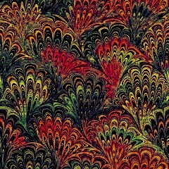
I ended the last post by asking what the effect would be if a contrastive filter was applied to the "feathered" part of graphics derived from brown128.jpg. Before I get to that, I'd like go back to the enlarged version of the original background tile. (Well, a relabelled version.)


1. In the third Opal post, the areas indicated in #1 had their colour muted/paled. In this post, though, they are the ones not being neutralized. Although there are numerous bands in these sections (which may well react differently to the filter), they will remain coloured.

2. Areas that are dark in the original graphic will remain so.

3. The narrow brownish-grey band is lighter than the surrounding zones. My first attempts at bicolours involved colourizing this part of the graphic. With some of the more highly derived variants, the result was vividly contrastive. However, in many of the variants that I have made, this stripe takes on essentially the same hue as the areas that surround it—though it remains distinctly paler:


Once I had figured out how to use contrastive filters to produce the sorts of variants in Opal Part #3, I then tried the same method to strip out all the colour from the other parts of the graphic, turning them a true grey.


As you can see, in some of these background tiles, the narrow band (#3) is so pale as to appear white.

Naturally, I then thought of trying to get darker variants—ones in which there is a broad dark area (combining #3 with #2) that contrasts strongly with the coloured portions of the graphic. The first thing I did was simply darken the whole thing, using the Contrast on Microsoft Picture Manager to keep the coloured areas (#1 on the enlarged picture above) as distinct as possible from the dark areas (#2 and #3).

Since these variants have had not been affected by contrastive filters, the dark areas retain some colour. The #3 band is therefore tinted, as it was in the first examples up at the top.


It becomes more complicated if one wants these areas not to be tinted. In particular, any contrastive filter used to counter the hue of the #3 band will also affect the rest of the graphic, lending unwanted colour to the dark zones in #2, which often have a different underlying hue. It requires that the variant to be tweaked be carefully selected; and, even then, there's a little dance back and forth trying to get the ideal balance.

Nevertheless, I do have a few examples of black-and-coloured (or at least dark-and-coloured) variants where the #3 strip is grey and surrounded by a broad very dark, almost colourless zone.


And, just to prove that what goes around can keep going round and round, I've sometimes overshot on the filter and accidentally recoloured the #3 band, resulting in a new bicolour!


(In the middle one above, for example, I used a green filter to counter the redness of a brown zone. You can still see traces of the original colour—now turned to olive brown—if you look carefully.)

But it doesn't end here.

On 6 January 2021, it occurred to me to try using contrastive filters not on dark colours (to produce dark grey to black) but instead on light colours (to produce light grey to white). For this I went back to the one of the gaudy multi-coloured flat variants that I'd created the previous fall. At this point, I'm not sure exactly which one it was, for there are several very similar ones. However, it may have been the one below. Certainly, it was basically purple with yellow bits; but there was also some red in it.

To it, I applied a blue filter. This turned the purple areas indigo-blue; but it completely countered the yellow, turning those areas off-white.


Blue filters have also been applied in the following four examples:


Given how very different the four initial graphics were, it may seem odd that the results are always blue & white (or blue & purple & white). However, the colour that best mutes pale is yellow. Other colours mute darker, often to quite a deep grey. In all cases, therefore, the original graphics I selected were ones with yellow in the feathering, regardless of the hue of the rest of the pattern. If you look at the original graphics of each pair above, you can see that—whatever colour the rest of it is—the part that I have turned white was originally a shade of yellow, golden orange, or chartreuse.

The contrastive colour to yellow is blue, which is why I used a blue filter. As the colour is well saturated, it must be applied fairly strongly. As a result, it winds up tinting the whole graphic. However, the effect of the filter on the other colours will vary, hence the (relatively subtle) differences in the end result.

After I first figured out what to do, I tweaked the result a bit, and then took the best graphic off to GRSites.com to run it round the colour wheel. The white areas always stayed white: it was the coloured bits that were altered by the colour-wheel-rotation doohickey. That gave me a full range of combinations of colour-and-white variants; and I then tweaked those graphics some more.

Here are a further selection of graphics with areas of white—or at least pale tints—within a dark zone. Some are obvious bicolours, while others have tonal variation.


One last point: as I described in the Rose Quartz post, it is possible to retint the white areas. Most often, when I do this, it is to add just a touch of yellow to give it a creamy colour. However, the variants below show other combinations:


Previous Days:
Prompts #1 and #2 (Amber and Topaz)
Prompt #2 (Rose Quartz)
Prompt #3 (Garnet)
Prompts #3 and #4 (Moonstone and Hematite)
Prompt #4 (Kyanite)
Prompt #5 (Peridot)
Prompt #5 (Bloodstone)
Prompt #6 (Aquamarine)
Prompt #6 (Amethyst)
Prompt #7 (Sunshine Jasper)
Bonus #1 (Turquoise)
Bonus #2 (Smoky Quartz and Onyx)
Bonus #3 (Rubellite)
Prompt #7 (Opal) - Part One
Prompt #7 (Opal) - Part Two
Prompt #7 (Opal) - Part Two-and-a-half
Prompt #7 (Opal) - Part Three


greerwatson


Prompt #7: Opal

In this post, I'm going to discuss the use of coloured filters a bit more.

When you apply such a filter to a graphic, its effect is overall. However, although it modifies the hues of the coloured areas, white areas simply get a flat clean wash of the pure colour. This is how a new colour can be added to the graphic. For example, the following sequence shows how I turned a background tile in purple shades into a purple/yellow bicolour (that I included in the Amethyst post).


If you're curious, the colour was "cleaned up" by pushing the contrast a bit. Here are a few more examples:


A fair number of graphics shown in earlier posts use this technique, in combination with others. Eventually, I got the impression I'd pretty well done all I could with brown128.jpg and was basically just repeating myself. It was quite a while before it occurred to me that I could be a bit more creative in my use of filters.

In an earlier post, I described how I used contrastive colours to grey out part of the pattern. Given how long I've been playing with these graphics, I was a bit surprised to trace back through the collection and realize that it was less than two years ago that I thought of trying this. In fact, it was on 1 November 2020 that I took the first graphic in the set below and applied a red filter to counter the turquoise:


The result was intriguing, but not especially exciting in and of itself, though it did show potential for future development. I tried the same technique on a few other tiles with similar results: a sort of muddy muted greyish shade combined with bright "feathering".

The following day I went back and tweaked things, aiming for a true grey. This time, though, I came up with a truly startlingly gorgeous result:


And if, to your eyes, it's not startlingly gorgeous, then just remember (for I'm sure I've mentioned it!) that I'm particularly fond of the colour brown and related shades.

Of course, the first thing I did was hie off to GRSites.com and run it through their colour-wheel-rotation doohickey. This yielded such variants as these:


I explained back in Post #2 how further work paled the grey areas to pastel and off-white, with just enough shading remaining to give the pattern shape. You've seen the following examples before; but I'm repeating them for comparison purposes—both with the ones above and the results of later tweaking:


Using the technique described at the beginning of the post, a bicolour can be achieved with a fairly deeply saturated filter. Of course, it will somewhat influence the hue of the "feathers"; but it will also wash a contrastive colour over the pale areas:


However, if only a lightly saturated second filter is applied (perhaps with a touch of contrast), this can add complexity to the pale areas without washing the ground colour out entirely. In this context, it is important to remember that, when a coloured filter is applied to a graphic, its effect on areas where the colour is saturated, though real, is less obvious to the eye than its effect on pale areas.


The obvious next question, of course, is this: if filters can be used to produce a pale grey or beige (and then white), can one mute out the colour to a dark shade and thence to black?

The answer is ... sort of. If you look at even the variants above with the palest areas, they aren't pure white: more off-white with tinting, thus showing the pattern. Similarly, you don't really get true black, since there is always some residual colour in the pattern. Still, on 2 November 2020 (the same day I made the striking beige-toned one above), I also produced these:


Among the variants shown in earlier posts were some made using this technique. I repeat them—now in the context of their derivation—with a few more added for good measure:


You can lighten graphics like these (and then add variety with other filters); but there's a limit to how much you can darken them and still have definition. Basically, because computers use additive colours, the more you work with these graphics, the lighter they get.

And, of course, there is a next question. In this post, I've been showing what happens when contrastive filters are applied to the broad areas of the background tile. So what happens if you try applying such a filter to the "feathers"?


Previous Days:
Prompts #1 and #2 (Amber and Topaz)
Prompt #2 (Rose Quartz)
Prompt #3 (Garnet)
Prompts #3 and #4 (Moonstone and Hematite)
Prompt #4 (Kyanite)
Prompt #5 (Peridot)
Prompt #5 (Bloodstone)
Prompt #6 (Aquamarine)
Prompt #6 (Amethyst)
Prompt #7 (Sunshine Jasper)
Bonus #1 (Turquoise)
Bonus #2 (Smoky Quartz and Onyx)
Bonus #3 (Rubellite)
Prompt #7 (Opal) - Part One
Prompt #7 (Opal) - Part Two
Prompt #7 (Opal) - Part Two-and-a-half


greerwatson


Prompt #7: Opal

Okay, Part is a ridiculous thing to call it. However, this is not Part 3, which will talk about techniques some more. It's just that, over the past few days, I've been working quite bit on the "tapestry" variants and come up with a number of interesting ones. In some cases, I've increased the saturation and/or contrast; but I've also been playing with filters trying to produce new colours and combinations.


A different route got me a fancy red-and-yellow one:


I still can't achieve a good purple in this set, though.

So I tried a different line of derivation. Of course, as I was starting from a different graphic, the result is texturally different from the ones above—more lacy, to my eyes. As you can see, besides purple variants, I also got turquoise/blue/green ones:


Following up with this has produced a rather different (but also fancy) red-and-yellow one:


Previous Days:
Prompts #1 and #2 (Amber and Topaz)
Prompt #2 (Rose Quartz)
Prompt #3 (Garnet)
Prompts #3 and #4 (Moonstone and Hematite)
Prompt #4 (Kyanite)
Prompt #5 (Peridot)
Prompt #5 (Bloodstone)
Prompt #6 (Aquamarine)
Prompt #6 (Amethyst)
Prompt #7 (Sunshine Jasper)
Bonus #1 (Turquoise)
Bonus #2 (Smoky Quartz and Onyx)
Bonus #3 (Rubellite)
Prompt #7 (Opal) - Part One
Prompt #7 (Opal) - Part Two


greerwatson


Prompt #7: Opal

In the last post I gave a couple of examples of how I play with graphics to produce new ones. In particular, I showed how I got the first variant in the trio below. That was back in 2010. Ten years later, I returned to play with it some more. A bit more experienced with the things Microsoft Picture Manager could do, I decided to lighten it, and then to saturate the colour more deeply.


I then ran this through GRSites' colour-wheel rotation doohickey. The following are three graphics that are shifted to a relatively minor degree:


The sensitivity of the eye to slight differences in hues in the green-yellow-orange range means that, even though the saturation has reduced the amount of muted (or grey) shading, the blend of colours makes up for it. The result is a rounded three-dimensionality.

Here, however, is a selection of variants derived by rotating the same graphic further round the colour wheel:


Clearly all these variants have a narrow band of contrasting colour running through the tips of the "feathered" areas. However, compared with the first three, they otherwise look much flatter (even though there are clearly differences in hue, most notably in the "V" area on the purple variant). This is partly because the eye is less sensitive to variation in the green-blue-purple-magenta range; but also the brain is more likely to interpret it as a change in colour rather than as three-dimensional shading. This is particularly marked with the blue variant, where the blue areas seem almost solid.

The textural difference was a surprise at first; but then I decided it would be interesting to play around with it.

One of the first things I did was try to produce a wider range of colour combinations. I did this by applying filters. For example, I took a green & blue variant (probably the first graphic in the set below) and applied a red filter. The combination of red and green turned those areas a rather muddy yellow, while the blue "feathers" turned magenta. Heavily increasing the saturation brightened all the colours to give the third variant.


If you compare it with the first set of examples, you can see that this method has produced a yellow variant whose feathering is magenta, while the original yellow variant had turquoise feathering. Of course, I then rotated the new graphic round the colour wheel to produce further new combinations. I also pushed the saturation to "flatten" the variants even further, as you can see:


Okay, I have to admit that sometimes I did take it too far:


So there were duds. Still, these (and other) graphics were the raw material from which I eventually produced background tiles such as these:


Most recently, I've worked on the following series. I think they have a sort of tapestry look to them:


Alas, with the demise of GRSites.com, I can no longer run them round the colour wheel. I wish I could: I'd like to see what happens.

Compare the original graphic with the variant below (which also came from this batch). It's travelled a long way just to get back to brown! Even so, the original pattern is still recognizable.


Previous Days:
Prompts #1 and #2 (Amber and Topaz)
Prompt #2 (Rose Quartz)
Prompt #3 (Garnet)
Prompts #3 and #4 (Moonstone and Hematite)
Prompt #4 (Kyanite)
Prompt #5 (Peridot)
Prompt #5 (Bloodstone)
Prompt #6 (Aquamarine)
Prompt #6 (Amethyst)
Prompt #7 (Sunshine Jasper)
Bonus #1 (Turquoise)
Bonus #2 (Smoky Quartz and Onyx)
Bonus #3 (Rubellite)
Prompt #7 (Opal) - Part One


greerwatson


Prompt #7: Opal

I've been saving Opal for last because, since the gem is inherently multi-coloured, it's the ideal prompt for a discussion of multi-coloured variants. It's turned out that I have rather a lot of graphics that qualify for this prompt; so, as they were made by a variety of different techniques, this is going to be Part One. Fortunately, one is allowed to post to the Sunshine Challenge at any time. As the mods say, "there is no deadline".

So far, I've shown the way I started making bicolours, i.e. by first using Microsoft Picture Manager to tint the muted parts of the original brown128.jpg with coloured filters, and then increasing the saturation and contrast to brighten the colours (as well as using the colour-wheel rotation doohicky on GRSites.com to shift the combinations of hues). Before I go further, therefore, let me show you a few more examples made by these methods. Some were created years ago; but I contrived the red & blue one—from the pink & blue one—literally while in the throes of working on this post.


As the bottom row shows, this technique can sometimes produce tricoloured variants.

You may be starting to get an idea of how the different techniques act on the graphics. However, before I start discussing some of the ways they have interacted to produce novel sorts of variants (in Part Two), I thought it help to have a look in detail at brown128.jpg. Although it looks monochrome, it actually has quite a complex pattern. So I've blown it up.


enlargement of brown128.jpg, labelled


  1. Let's start with the broad wing-shaped feathery bit that I've labelled No. 1. As you can see, much of its area consists of looping curves whose shape is distinct—hence the "feathers"—but which are only slightly different shades of brown. The feathery pattern is accentuated, however, by a broad dark border with a narrow pale rim. Just inside the border is a thin line of grey. When filters are applied to the graphic, each of these areas will respond differently.
  2. Note that the section in No. 1 also includes a line of saturated red. A similar line is found in one of the other sections as well. Whatever is done to one will also happen to the other: for example, if the colour-wheel rotation device is applied, both lines will alter identically.
  3. In this fan-shaped feathered area, there are a series of light, mid, and very dark bands: whatever happens to the graphic, each of these bands is probably going to respond differently. In particular, the outer band is muted red, while the light brown band is muted orange: not only these will respond slightly differently when the colours are rotated, but the differences will be accentuated if contrast levels are increased.
  4. At the base of this fan-shaped area is a pale beige triangle. It's the same colour as the fine line rimming the feathery shape in No. 1.; and the two will be altered similarly in all variants. Note, though, that the V-shape is outlined in red at the top. As the colours are rotated, this can result in a shading of colour in the upper part of the triangle. Often, too, the paleness of the triangular area is accentuated, even to the point of its becoming white. On the other hand, if the contrast level is high, then the faint lines in the V become stronger, resulting in a clear striped effect.
  5. There is another, somewhat rounded area which is distinctly lighter, and has multiple bands in mid, light, and red shades. As contrast increases and filters are applied, this area often splits into very distinct loops.
  6. The dark areas remain dark, relative to the other parts of the pattern. As contrast increases, they may turn black. If coloured filters are applied they will normally manifest as dark shades. If the whole graphic is simply lightened overall (as in the pink & blue example above), these areas will become somewhat tinted greyed areas.
  7. Running across the tile is a curving, looping ribbon of light grey, with muted bands near it. This area is susceptible to coloured filters. All early bicolours resulted from tinting it; and later modification has often resulted in this region being vividly different in colour from the rest of the pattern.
  8. Right above the wing-shaped feathered fan in No. 1 is an area that looks almost uniform in colour. In fact, it is filled with fine bands; but these do not greatly differ in saturation. They may react differently to coloured filters; but they are so narrow that the new colours tend to blur together into an intermediate shade.

Overall, the interplay of light and dark areas lends depth to brown128.jpg and the derivatives shown here. As the contrast level is pushed up, the paler V looks increasingly like a background across which the feathered areas seem to occupy the mid-to-foreground; and, as coloured filters deeply tint the muted areas, ribbons of contrasting colour curl across the page.

The following set of background textures will give you an example of how I play with a graphic to see what I can do with it. The initial graphic, which you can see on the left of the top row, was created in 2012. Earlier this year, going through old variants, I thought I could see possibilities in it. The next three have been selected from a single session in March, and appear in the order they were made; and the last two in the middle row were made in April. This weekend, I went back to see how much further I could push it, and made the ones in the final row.


And here is another line of derivation. The first graphic was created on 5 October 2010 as part of a fairly busy session; and, almost immediately, I started tweaking it. A yellow filter smoothed out some of the harshness of tone, and added a creaminess to the pale areas. Then I strengthened the saturation, which increased the yellowness, but also turned the blue areas turquoise. Finally, I increased the contrast: this clarified the colours and deepened the dark areas, adding an impression of depth.

After that, I ran the newly created graphic through the GRSites doohickey. In one direction this gave me variants in which the orange areas turned gold or yellow; and, in the other direction, it gave me variants in which the orange areas turned red. For a while, I was reasonably satisfied with what I'd achieved. Given the fairly simple bicolours I'd produced up till then, getting tricoloured variants was actually quite startling.

This past weekend, though, I went back and applied the things I've learned since then about lightening and brightening, and applying various filters. This produced the last two variants:


I'm going to stop here, since there are more types of techniques I've used to create new variants; but I have to organize things. There will be a Part Two!


Previous Days:
Prompts #1 and #2 (Amber and Topaz)
Prompt #2 (Rose Quartz)
Prompt #3 (Garnet)
Prompts #3 and #4 (Moonstone and Hematite)
Prompt #4 (Kyanite)
Prompt #5 (Peridot)
Prompt #5 (Bloodstone)
Prompt #6 (Aquamarine)
Prompt #6 (Amethyst)
Prompt #7 (Sunshine Jasper)
Bonus #1 (Turquoise)
Bonus #2 (Smoky Quartz and Onyx)
Bonus #3 (Rubellite)


greerwatson


Bonus #3: Rubellite

When I did the post for Amethyst, I decided not to include the shades between violet and red. However, I'm sure there are others who adore them; and, as I do have some variants in those colours, it doesn't seem fair—if only to the graphics themselves!—to leave them out. So here are a small selection in shades of fuchsia, orchid, puce, and burgundy.

I had to google to find a semiprecious stone in this colour, and was lucky enough to come up with Rubellite. It's one of the names for the pink or red tones of Tourmaline.

As before, I'm going to start with some monochromatic versions:


And now for some fancier ones:


Previous Days:
Prompts #1 and #2 (Amber and Topaz)
Prompt #2 (Rose Quartz)
Prompt #3 (Garnet)
Prompts #3 and #4 (Moonstone and Hematite)
Prompt #4 (Kyanite)
Prompt #5 (Peridot)
Prompt #5 (Bloodstone)
Prompt #6 (Aquamarine)
Prompt #6 (Amethyst)
Prompt #7 (Sunshine Jasper)
Bonus #1 (Turquoise)
Bonus #2 (Smoky Quartz and Onyx)


greerwatson


Bonus #2: Smoky Quartz

This bonus post was inspired by what is probably my favourite colour, brown. Yes, warm shades of rust and tan (and a few browns) appeared in the Amber post; and brown has appeared in combination with yellow, green, purple, and turquoise. However, there are so many shades of brown that haven't been touched on yet, at any rate not in variants where brown or beige is the dominant colour. Smoky Quartz seems like the most appropriate stone for this bonus post.


Because I'm fond of brown tones, I have them in a variety of textures. A light hand with the contrast can result in significant differences in appearance when dealing with monochromatic variants. Here are some fawn examples:


Of course, there are also a lot of very fancy variants, too:


Bonus #2b: Onyx

Onyx is a banded form of chalcedony. It's basically the same as Agate, but the bands are parallel rather than curvy. Given the feathery pattern of brown128.jpg and its derivatives, Agate would probably be the more appropriate semiprecious stone to use here, except that agate comes in many patterns and colour combinations; but Onyx is most commonly associated with black or black & white.

The following variants resemble some that appeared for Moonstone and Hematite; but those were clearly achromatic, or nearly so. The variants here are all coloured variants in very dark and pale tones.


Previous Days:
Prompts #1 and #2 (Amber and Topaz)
Prompt #2 (Rose Quartz)
Prompt #3 (Garnet)
Prompts #3 and #4 (Moonstone and Hematite)
Prompt #4 (Kyanite)
Prompt #5 (Peridot)
Prompt #5 (Bloodstone)
Prompt #6 (Aquamarine)
Prompt #6 (Amethyst)
Prompt #7 (Sunshine Jasper)
Bonus #1 (Turquoise)


greerwatson


Bonus #1: Turquoise

When I did the prompts for Kyanite and Aquamarine, my focus was on hues and combinations from greenish shades of turquoise through to indigo. Only afterwards did I realize that I had not dealt with one fairly prolific colour combination: turquoise (or blue) with brown.

I have other plans for our last prompt, Opal. However, there are other semiprecious stones that weren't included in this year's Sunshine Challenge. This gives me an excuse for creating this bonus post.

If a turquoise filter is applied to the original graphic, brown128.jpg, the result is a rather dim brown and grey pattern, as in the second graphic below. However, increasing the saturation of the colours boosts the brown and turquoise tones. Further application of filters and contrast produces examples like the third graphic.


From there, it is easy to create the sort of variation found in the row below:


Other lines of derivation were used to create these variants:


Previous Days:
Prompts #1 and #2 (Amber and Topaz)
Prompt #2 (Rose Quartz)
Prompt #3 (Garnet)
Prompts #3 and #4 (Moonstone and Hematite)
Prompt #4 (Kyanite)
Prompt #5 (Peridot)
Prompt #5 (Bloodstone)
Prompt #6 (Aquamarine)
Prompt #6 (Amethyst)
Prompt #7 (Sunshine Jasper)


greerwatson


Prompt 7: Sunshine Jasper

Sunshine Jasper is an opaque yellow semiprecious stone, which means that this post is going to be about yellow graphics based on brown128.jpg. However, if one looks at the original, which is brown, and at the equivalent when the GRSites.com colour-wheel-rotation doohickey is applied, there is no obvious yellow version. However, have a look at the second graphic below. Because it is in muted tones, it appears an olive-brown colour. Its yellow base colour becomes clear, however, when the saturation of the colour is increased:


What the third graphic also shows is that, for the most part, monochrome yellow(ish) variants will tend to have the pattern marked out in shades of tan, brown, or grey. Furthermore, simply increasing the saturation accentuates any orange or green tints; so the result looks yellow & orange or yellow & olive. This certainly complicated my attempts to produce "solid" yellows!

Still, I did succeed in time; and you will find three examples in the first row. More heavily textured variants are in the rows below.


Note how brown tones increasingly shade the pattern as the variants become more complex. I added a few brown & yellow examples at the end of my first post (for Amber and Topaz); and here are some additional ones. Given the banded appearance of Sunshine Jasper, it seems appropriate.


Though slightly warmer than a true pale yellow (being based on more golden shades), I'm going to add a few variants in cream tones here as well.


A look at the photos of Sunshine Jasper shows that, while yellow is the dominant colour in the banding, some examples have a richer gold—approaching orange—among the stripes. While tawny and burnt orange shades were covered in the post on Amber and Topaz, many golden variants of brown128.jpg approach orange and/or have orange marking out the pattern. This happens because, when the saturation is increased, the muted (darker) areas of the pattern become reddish.

Take, for example, the deep gold of the first graphic here. I literally derived the second one from it just by increasing the saturation and contrast of the colours.


So let's have a look at some orange and orange & yellow variants.


And, since I added a selection of cream variants above, I'll finish with a few peach ones.


Previous Days:
Prompts #1 and #2 (Amber and Topaz)
Prompt #2 (Rose Quartz)
Prompt #3 (Garnet)
Prompts #3 and #4 (Moonstone and Hematite)
Prompt #4 (Kyanite)
Prompt #5 (Peridot)
Prompt #5 (Bloodstone)
Prompt #6 (Aquamarine)
Prompt #6 (Amethyst)


greerwatson
22 July 2022 @ 02:24 am


Prompt 6: Amethyst

With Amethyst we come to purple variants—and a problem, since the word "purple" means different things to different people. I like the colours that, to me, are true purple, i.e. shades from indigo to (spectrum) violet, and perhaps those a little redder, such as grape; but I'm not fond of shades in the magenta range, which are also called "purple" by some, especially those in the field of Optics. However, the gemstone falls more in the former range; so I can focus on the hues I prefer with a clear conscience!

As before, I'd like to start with some essentially monochromatic ("solid") versions, in which the pattern is visible only as a texture. More heavily textured graphics are in the second and third row.


Of course, different shades of purple can also be combined with contiguous colours. Here, for example, is a slightly quieter set of "bluebell" variants:


And here are a more varied selection, including ones that combine purple with blue tones:


And purple with turquoise:


While this might seem to be all to say about purple variants, there is one particular (and rather unexpected) range of bicolours that turned up as a result of the use of the GRSites.com colour-wheel rotation software:


When rotated round the colour wheel, the muted areas (that, after much tweaking, produced the "feathery" bits in the earlier examples) have been altered to a brownish tint. On the other hand, applying a purple filter to the original graphic tints the muted areas to shades of lavender.


I think it's pretty clear how the graphics on each row are related to one another.

Sometimes when I was following one of these productive lines of tweaking, a whole family of variants would emerge. The examples below show how such variations can evolve. In fact, the top row here were all created in a single session in the order shown. A creamy tint emerged in the lighter sections of the graphic; and you can see in the lower row how, in later sessions, this was deepened to eventually produce a purple/brown/yellow tricolour:


On the other hand, along the way, I also got things like this:


A lurid looking thing, isn't it? (Not all the graphics I create look equally promising.) In this case, the filters and contrasts I applied really reduced the red: the brown became yellow; and some of the purple areas turned blue. Yet, in fact, I have used this variant (or a slightly darker version of it) as the background for a story about a fireworks celebration. So you never know.

Combinations of shades of purple with brown, beige, tan, gold, yellow, cream and/or ivory have also appeared through other methods of manipulating brown128.jpg. So, to finish this post, here are a mixed selection:


Previous Days:
Prompts #1 and #2 (Amber and Topaz)
Prompt #2 (Rose Quartz)
Prompt #3 (Garnet)
Prompts #3 and #4 (Moonstone and Hematite)
Prompt #4 (Kyanite)
Prompt #5 (Peridot)
Prompt #5 (Bloodstone)
Prompt #6 (Aquamarine)


greerwatson
20 July 2022 @ 12:05 am


Prompt 6: Aquamarine

For previous prompts, I've looked at blue versions of brown128.jpg (Kyanite) and green versions (Peridot). This time, I'm going to start with the colour that lies between them, turquoise, and then go on to variants that combine turquoise with blue and/or green.

As before, I'd like to start with some essentially monochromatic ("solid") versions, in which the pattern is visible only as a texture. More heavily textured graphics are in the second and third row.


Back when I did the prompt for Kyanite, I demonstrated how GRSites' colour-wheel-rotation doohickey worked on a set of graphics I dubbed "the bluebell collection", which ran from blue & turquoise variants through various gradations to magenta & indigo. However, it is also possible to turn the colour wheel in the other direction, running through turquoise to green:


As you can see above, the "feathery" areas are coloured (rather than muted, as in the original brown128.jpg),and contrast with regions in the other colour that have much the same degree of saturation, and in some instances are only slightly lighter.

The following variants follow much the same pattern, except that the "feathers" are much more strongly saturated than the rest of design, and thus stand out sharply. These variants have a clean distinction between the areas of different colour.


Here is a somewhat different pattern: again the "feathers" are coloured, but the contrast has been pushed so that there are sharper loops, and distinct stripes in the lighter areas.


Of course, there are quite a wide range of other variants with various combinations of turquoise and/or blue and/or green:


Previous Days:
Prompts #1 and #2 (Amber and Topaz)
Prompt #2 (Rose Quartz)
Prompt #3 (Garnet)
Prompts #3 and #4 (Moonstone and Hematite)
Prompt #4 (Kyanite)
Prompt #5 (Peridot)
Prompt #5 (Bloodstone)


greerwatson
19 July 2022 @ 04:44 pm


Prompt 5: Bloodstone

Since bloodstone is coloured in patches of red and green, this post is going to be the first to actually focus on bicoloured graphics. However, I have to admit that—given the colour combination—I actually think of this as "the Christmas collection". In fact, it was actually in December 2012 that I first started trying to create red-and-green variants of brown128.jpg.

As you can see the first attempts weren't all that great:


Here are some examples of the sort of changes that I tried on the red(dish) one with the green markings. Clearly it needed to be brighter: the first example below, therefore, has had the saturation of the colour increased. However, it still has a rather yellow cast: the red is rusty in tone, and the green is olive-tinted. In the second example, a filter was used to reduce this, resulting in "purer" colours. The last one takes things in a different direction, lightening the graphic and increasing the contrast so that lines of yellow and chartreuse start to appear.


Here are examples of similar changes I tried on the other graphic, the dark green one with crimson highlights. The middle one actually has quite a good "leaf" effect, if the leaf is some sort of tropical thing with red veins. However, it's not exactly Christmassy. Now if I only wrote fic with a jungle setting....


I've refined these graphics quite a bit since then, as well as producing red-and-green variations from other lines of development. I suspect that, having seen the examples above, you may recognize the ancient history of some of the ones here:


The joke is that the best of these have been made fairly recently; and, as I've written few Christmas fic in the past years (even for Yuletide), so far I haven't actually used any of them on my website.


Previous Days:
Prompts #1 and #2 (Amber and Topaz)
Prompt #2 (Rose Quartz)
Prompt #3 (Garnet)
Prompts #3 and #4 (Moonstone and Hematite)
Prompt #4 (Kyanite)
Prompt #5 (Peridot)


greerwatson
17 July 2022 @ 06:19 pm


Prompt 5: Peridot

Basically, this post is about green variants of brown128.jpg—though things are going to get rather more interesting than simply rotating the original graphic round the colour wheel:


Peridot is often simply referred to as green; but googling makes it clear that it ranges in colour from yellow to emerald, as well as in various muted shades from olive to brown. In other words, in this post, it would not be appropriate to deal with blue-green or turquoise-green tones; so I'll save these for later.

Ihe full range of colours for the gemstone includes variants like the ones below, though the first one (a light olive green) seems to be the commonest shade in pictures of jewellery:


Of course, there are many shades of green—from deepest forest and ivy greens to pale spring green. Here are a few that are more deeply textured:


And as soon as different shades of green are combined (sometimes with white, grey, or black), then the possibilities multiply enormously:


One more thing should be mentioned: like red, green is often combined with yellow to "brighten" it. So here are a few green/yellow examples:


I've been asked how I create bicolours, given that the original graphic was basically monochromatic. Well, it's been a journey! Checking the Properties of some of the early graphics, it looks as though I started in the summer of 2010. You can see something of what I was doing back then if you look at the sequence below. The first graphic is the colour-rotated one that I showed up top. The muted areas in the design are greyish, but not truly achromatic. My first efforts at applying filters, therefore, came when I wanted to crisp up the design. As you can see in the second graphic, I tended to overshoot: this gave the "feathering" a faintly bluish tint, and eventually led to a family of green/blue variants as I refined the pattern. Around the same time, a different use of filters produced the third graphic:


And so it began. At some point in there, I proudly showed a selection of my newest creations to my sister. After about three or four examples, she kind of rolled her eyes and said, "I get it! I get it!" (Things have progressed a bit in the years since then; but I don't think tweaking background tiles is her thing.)

Actually, it took me a while to figure out how to reverse the colour wheel so that I could get variants with a green background and brown feathering where the original was muted. The key is that, when you apply a coloured filter over the whole graphic, the grey areas are affected completely, having no inherent colour, while the green areas are only modified. The first example here was created in 2011. The others are the product of ever-further refinement and development.


I still go back now and then, as I get better at playing with Microsoft Picture Manager. The last of those was made in 2020. However, since those days, I've come up with ever more intriguing ways of producing colour combinations. So let's look at a selection of more recent green/olive/brown variants:


Yes, I do like earth tones. Also, when you're in the green to brown range, slight variations (from a computer's perspective) produce major perceptual differences (from a human point of view). I think it has some evolutionary thing to do with distinguishing ripe from unripe fruit, and spotting things that are no longer good to eat.


Previous Days:
Prompts #1 and #2 (Amber and Topaz)
Prompt #2 (Rose Quartz)
Prompt #3 (Garnet)
Prompts #3 and #4 (Moonstone and Hematite)
Prompt #4 (Kyanite)


greerwatson
14 July 2022 @ 03:30 pm


Prompt 4: Kyanite (also Prompt 1: Lapis Lazuli)

Both kyanite and lapis lazuli (the alternative first prompt) are blue semi-precious stones; so this set of graphics obviously is going to involve shades of blue. First of all, let me show you what the blue version of brown128.jpg looks like, i.e. when the GRSites.com colour-wheel-rotation doohickey is applied to the original graphic. As before, click on the graphic to see what it looks like when tiled across a webpage.


As you can see, the brown portions of the original have become shades of blue, but the olive-grey areas have become a brown-grey.

As with the last couple of posts, I'm now going to show you examples of all-blue ("solid") versions. I think I've mentioned that, depending on how I've derived them, there can be subtle differences, even when the shade of blue is very similar. Look at these two. (I suggest opening them in side-by-side tabs, so you can click back and forth.)


Of course, there are many shades of blue—from darkest navy to palest ice. Here are a rather more varied selection of blue variants, organized so those in the first row are lightly textured and those at the end have the most dramatic patterns.


Shades of blue also vary in hue from indigo tints bordering on purple to peacock shades approaching turquoise; and just as red is often seen in conjunction with its neighbours on the colour wheel, orange and yellow, so blue is often seen combined with turquoise and/or purple.

This is where the GRSites.com colour-wheel rotation doohickey came in handy: if I chanced on an attractive combination, I could shift the colours to produce a range of variants. Some of these would be far round the wheel; and the new combinations might appear so different as to seem completely unrelated (and might not be very successful to look at). However, minor shifts could produce a subtler range of variation. Here's one such set. Because I first created the blue/indigo version, I tend to think of them as "the bluebell collection".


(Sadly, GRSites.com is no more. I spent some time on line looking to see if anyone was offering some similar gadget; but I couldn't find anything like it.)

While I intend to look at bicoloured variants in a later post, I'm going to finish up here with a selection of graphics in which blue is the dominant hue, but is combined with touches of contiguous colours, either on the purple or the turquoise side.


Previous Days:
Prompts #1 and #2 (Amber and Topaz)
Prompt #2 (Rose Quartz)
Prompt #3 (Garnet)
Prompts #3 and #4 (Moonstone and Hematite)


greerwatson


Prompt 3: Moonstone
Prompt 4: Hematite

Black and white. Well, as far as the stones are concerned, bluish white and dark steel. To get an achromatic version of brown128.jpg, one can use Microsoft Picture Manager. The "color" tab has at the bottom a thingy that affects the saturation of the colours of a graphic; and, if the tab is shifted all the way to the left, the muting goes to the extreme, resulting in shades of black, grey, and white.


Not that that's how I started. Rather, I used the doohickey on GRSites.com, which produced darker/lighter and muted/saturated versions of each colour shift in a matrix of variants. I quickly found that it was fairly easy to produce very dark colours, though there was a tendency for the result to have considerable areas of black in the pattern. Here, for example, are brown/black, purple/black, and blue/black variants.


This set me the challenge of producing something that looked truly black. Or more accurately (bearing in mind that I still wanted the graphic to be patterned), black with dark grey. Achromatic variants were the answer; and you can see three versions below. The first is a lightly marked variant, where the feathering has the sort of effect you might see in a damask tablecloth (though tablecloths aren't usually black!); and the other two are increasingly contrastive so that the graphics have broadly-marked, easily discernible charcoal & black patterns.


Now, you might think that getting white variants would be just as straightforward. Oddly, it was not. When I simply tried lightening the graphic, I either found that areas went blankly white, with the pattern missing altogether, or else I got variants with the pattern clearly marked, but in rather too dark shades of grey for the result to be truly white, often with coloured tints remaining from the variant I'd been modifying. I was looking for something resembling a fancy white tablecloth. Instead, I was getting things like this:


All very well as far as they went. Quite effective, in fact, in their own way. However, it took me a long time before I finally managed—tackling the problem from different directions—to achieve the white damask look I wanted. In the end, since I was working from different source variants, the results looked a bit different each time. Here are three of them:


I suppose technically they're really palest silver grey and white; but there has to be some measure of off-whiteness to carry the pattern. (If you can't see the difference side by side here, try opening them in three tabs and quickly looking at each of them.)

There remains only to add some graphics in grey tones. I mentioned at the beginning that one can achieve this with pretty well any type of variant by desaturating its colours. This works best with multi-coloured graphics where there is a difference in the darkness of the colours involved: if you start with strong blue and fuchsia, the graphic will come out pretty flat; but, if you start with red and yellow, the red will turn to dark grey and the yellow to pale grey.

Sometimes, though, I didn't mute the colours all the way to achromaticity. Using chromatic greys (i.e. warm and cool greys) in part or all of the design can be very effective in making some sections pop.


Previous Days:
Prompts #1 and #2 (Amber and Topaz)
Prompt #2 (Rose Quartz)
Prompt #3 (Garnet)


greerwatson
10 July 2022 @ 01:22 pm


Prompt 3: Garnet

Red is a pretty basic colour; so, although it doesn't match the main prompt this time, I'm going to prioritize it. I think "moonstone" can be better combined with the next prompt, "hematite". Black and white go naturally together.

One of the interesting things about playing with brown128.jpg is that, even when one is trying simply to get a background tile that is "all red", the fact that there is a pattern to be preserved means that the result must be textured; and, depending on how one has tackled it, there emerges a remarkable range of possiblities. Given the nature of the colour-wheel-rotating doodad on GRSites.com, once I had something I liked, I could create a range of slightly different hues (i.e. more orange, purple, pink, or brown) as well as variants that were brighter/duller or darker/lighter. The first row here are all fairly "smooth" textures; the second row show more contrast. All, however, are some shade of red.


Red is fundamentally a dark colour; and, as such, some of the most effective variants are those that accentuate the grey portions of the original graphic or push the contrast to create black areas.


Of course, one can also combine rich red with pale shades—and maybe add black or flame orange for accents.


Looking at the bright tones in a couple of the ones above, it is easy to see why red is so often combined with yellow. I remember that, when I was small, my mother told me that red could be lightened with a little yellow—though not enough to make it orange, of course—but one never mixes red with white. If you do, she said, it immediately turns to pink.

At any rate, when one sees the red/yellow combination, there is a tendency to prioritize the red, treating the yellow as if it were there merely as a brightener.

So here are some red and yellow versions of the graphic. I've put the simpler versions in the top row and the most heavily "derived" versions at the bottom.


In case you're curious, when I saw the potential for the one in the middle of the last row, I did more than twenty slightly different variants before picking the one I thought most effective.


Previous Days:
Prompts #1 and #2 (Amber and Topaz)
Prompt #2 (Rose Quartz)


greerwatson
07 July 2022 @ 07:27 am


Prompt 2: Rose Quartz

The feathery brown graphic that, on GRSites.com, was called brown128.jpg is one that I've found elsewhere under other names on old websites containing collections of graphics. I've no idea where it originally came from. Some sites have versions of it in other colours; but these were formed by the application of coloured filters. In this way, for example, one can turn it red, as in the leftmost graphic below. If you look at it carefully, though, you can see that much of the subtlety of shading has been lost. (As in my first post, there's a link on the graphic. Click on it, and you can see how it looks when tiled over the whole page.)


GRSites.com, on the other hand, had a doohickey that rotated colours round the colour wheel. In other words the muted orange (i.e. brown) would be shifted—say to red or blue or green or purple—but any other colours in the graphic would also be shifted by the same amount. If there were several slightly different shades of brown, the result would be several different shades of red (or blue, green, etc.); and each part of the pattern would be bright or muted to the same degree as in the original. The graphic in the middle shows one of the possible reddish-toned variants that could be produced. One thing that is noticeable is that it is a muted shade (as the original graphic, being brown, is muted in colour); another thing to note is that the grey-toned portion of the feathering has not been glazed over with red, but remains grey.

To get pink, of course, a bit more manipulation is needed—to lighten and brighten the pattern as in the final graphic on the right.

Again, one of my projects was to achieve "solid" pink versions in this pattern:


Mostly, though, I've been trying to see what sort of combinations I can come up with. To make things more interesting, I've added some in darker tones, such as rose and carmine.


People have expressed some curiosity about the sort of thing I've done to get the variations. Well, here's one of them. A couple of years ago, it occurred to me to try using filters to blank out one of the colours, e.g. to use a purple filter to remove yellow, or a green filter to remove red. The result was a grey area—and a whole new range of possibilities! One obvious thing to attempt was paling the grey area to white; another was to produce pastels.


I could even make the graphic into a bicolour, for example by applying a yellow filter:


So (given this week's two prompts), let me show you some pink-and-yellow bicolours. These came from a variety of techniques.


I'll let the anthropomorficcers decide if these are Pink & Yellow or Pink/Yellow!


Previous Days:
Prompts #1 and #2 (Amber and Topaz)