So now we come to BLUE proper. To me, this is inherently a dark colour—though, of course, there are plenty of shades of blue from midnight to ice. It's the colour most associated with sapphires and delphiniums (though both come in quite different hues as well); and it's the colour of those little blue squill,
Scilla sibirica, that are so commonly massed under shrubs in flower beds in the spring.
One association of blue is with the police; and one of my favourite fandoms,
Forever Knight, is a cop show as well as a vampire show. Although Nick Knight himself is a plainclothes detective, there are uniformed officers in the police station in every episode; and they, of course, wear blue:
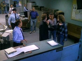 [NOTE: if you can't see the picture, click on it: I put a link on.]
In 2011, I wrote a story about Nick's first day in Homicide. "The New Guy" was written for
![[personal profile]](https://www.dreamwidth.org/img/silk/identity/user.png) lastscorpion
lastscorpion in the small fandom-specific gift exchange,
![[community profile]](https://www.dreamwidth.org/img/silk/identity/community.png) fkficfest
fkficfest. The story was originally
posted to LiveJournal (where the exchange was then run) and later
crossposted to AO3 and
my website.
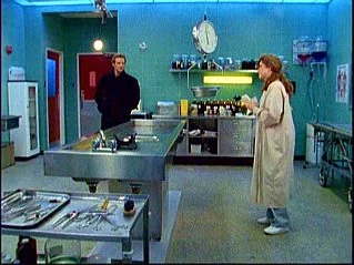
The plot of "The New Guy" is based on the flashback to a Season 1 episode, "Only the Lonely", which tells how he first met Natalie Lambert. It is canon, therefore, that he was brought into the morgue in a bodybag, having been blown up by a pipe bomb while trying to stop a robbery. Then, being a vampire, he regenerated on the autopsy table. To her great astonishment, of course; but she was intrigued enough to offer to research his condition in the hope of finding a way for him to turn mortal again.
At that time, Nick was not yet a police officer. (Or, at least, not in Toronto. Another flashback told us about his time as a uniformed cop in Chicago in the 1960s.) It was sometime thereafter that he contrived to join the Metro Toronto Police and get immediately assigned to work Homicide at the 27th Precinct.
Since "The New Guy" was about Nick as a policeman, I decided to go with a plain blue background, and bordered the central story panel with a textured blue and black border picked out in gold. I used a police badge in various sizes as a divider between the sections: this was clipped from a screencap. Admittedly, it was a close-up of Det. Schanke's ID. (He was Nick's partner in Seasons 1 & 2.) But Nick's would have looked the same.

When I later wrote two more canon-based stories told from alternative perspectives,
"Shift" and
"Copper's Instinct", I reused the same webpage design.